Not Sassure


Not Sassure Full family
- Not Sassure Medium
$23.99
A superfamily is a set of related typeface families that vary in optical size, width, or font category, etc. These families share a basic DNA and work seamlessley together.
Go to Not Sassure Superfamily.


A super-versatile industrial sans serif in 3 x-heights!


Brutal Types Pack #02
by Ramiro Espinoza, Sabina Chipara, Mathis Payet, Jolana Sýkorová
/ 2026
/
On Sale


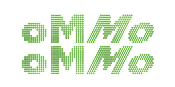


Such a joyful typeface! So much childlike delight in this one.


Moucha glues together so well in text — a nice surprise. I especially like the vintage version.


A 21st-century Didone that's sure to turn heads.


A sans with a happy vibe, almost winks at you with joy
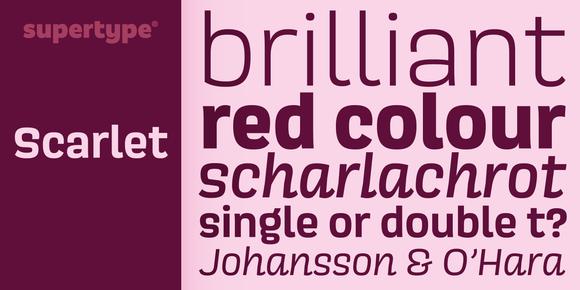


Bright, flickering neon lollypop vibes.


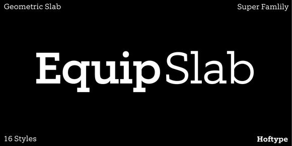
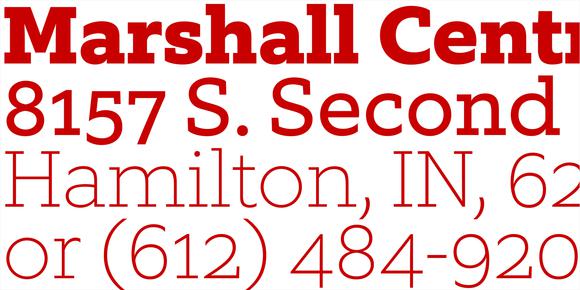


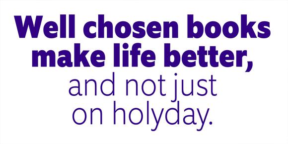


Recommended for sci-fi books and spaceship logos


A retro-futuristic, bubbly gem of a typeface.


Fun, bouncy and bubbly bubblegum vibes.


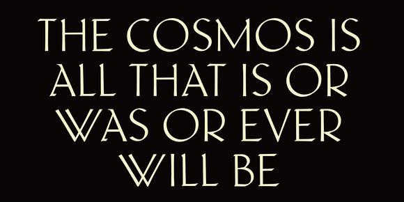


The best-selling handwriting script — for that personal touch.


A modern sans with height and width axes.


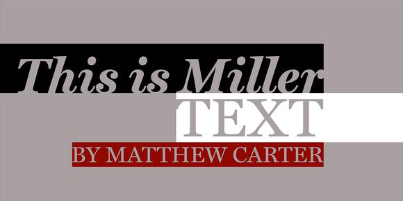
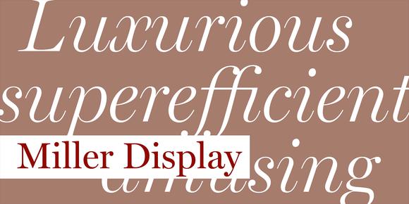









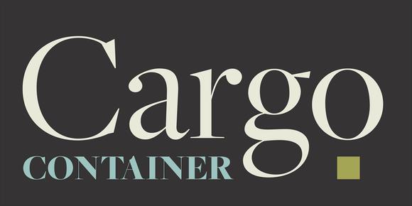
Try this for your next book cover or hit TV show.


How many typefaces have a sparkles axis!

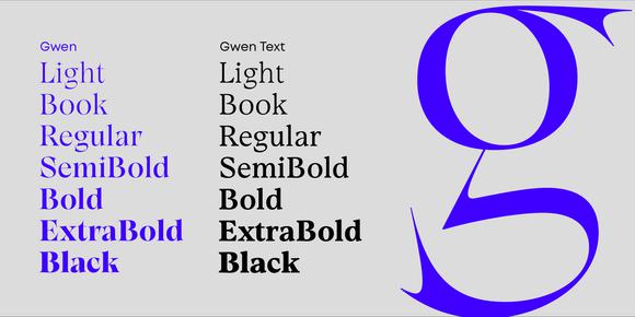


Bold and futuristic. Perfect for packaging and posters.


An expansive editorial design gem with lots of flare.


Stately design, effortless to use. You'll wish it had more weights!


Chonky without feeling bulky. Soft curves making all the difference here.


A small, no-nonsense, classic text face.


Perfect for logos and elegant titles. Check out those ligatures!


Classic roman letters bursting with calligraphic verve.


Art Deco meets Woodstock in this fabulous flared serif.


Instantly look professional and capable, really hard to mess this one up!




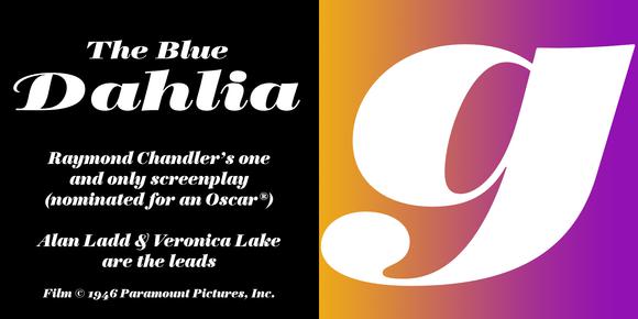
An elgant slab; the g is a work of art!




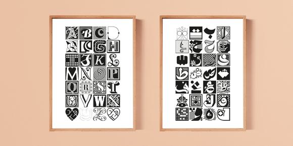
A masterpiece of Arabic type design, expertly crafted!


